Case Study Research and UX

Wells Endodontics

stakeholder interview

New website must:
Boast technology, testimonials, and unsurpassed quality patient care.

Introduce current doctors, staff, and physical office.

Provide quick and easy CTA for patient login.
“We want it to mirror who we are: modern, cutting edge technology, caring, stress free, the best at what we do. Our current website does not improve our presence online nor represent our daily effort to stay on top of technology and patient care.”
Read Full Interview

competitive research

In the world of dentistry and endodontics, website standards are very low. Competitors do not have well-designed or robust websites generally. While actual content is readily available, the overall packaging strategy and visual branding is weak. My research immediately instilled confidence, because we know that any improvement at all, will instantly exceed the competition. My client and I agreed to move forward on a product that will go above and beyond the average dental website.
View Full Document

site map

With an initial site audit, I unveiled the issue of the current sitemap (above): it is unorganized and “General Information” became a large dumping ground for all content. I proposed a new structure that combined information from the existing site, with additional new content. Together, the client and I identified the gaps, and discussed a plan for creating those assets. There is a significant difference from the old sitemap, to the new sitemap, as seen below:

priority guide

Starting from their existing site, I gathered and organized the entire content for their new site. This included several thorough steps: setting an outline and establishing hierarchy, compiling appropriate content, researching and fact-checking, writing and editing, and finally, presenting to my client for feedback. Producing the Priority Guides was well-worth our combined efforts, and effectively mapped out the creative assets needed.
View Full Guide

Case Study Visual Design

Wells Endodontics

branding and identity

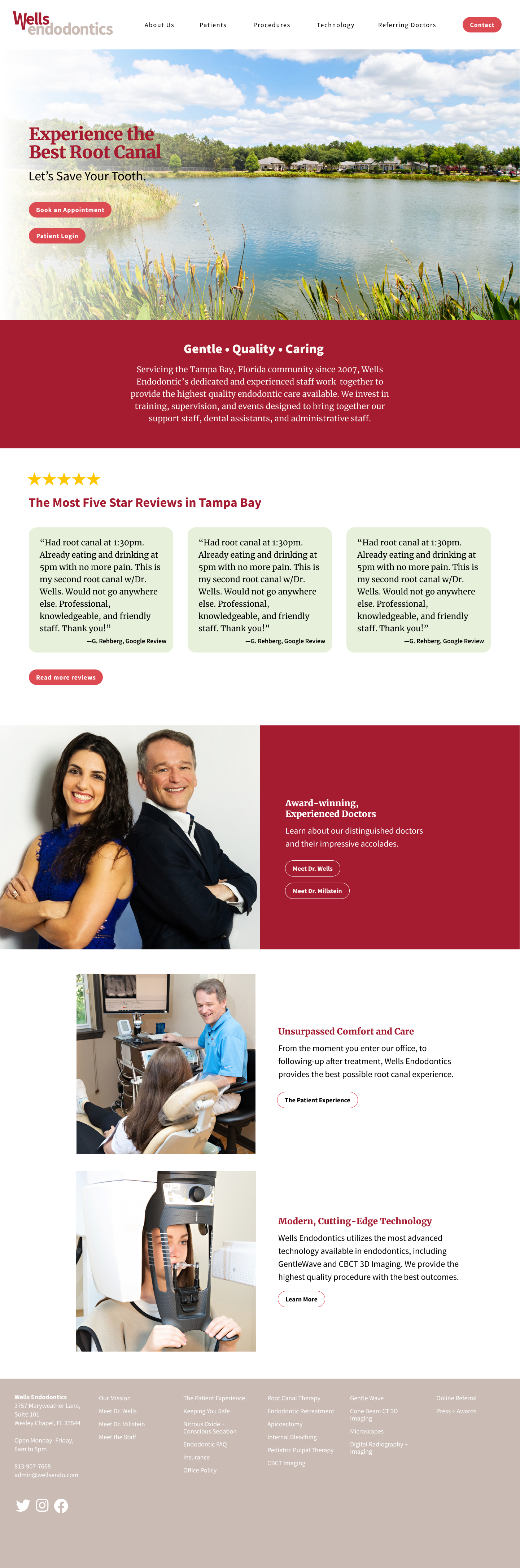
Although my client wasn’t initially interested in rebranding, they agreed to my suggestion of using this website redesign as an opportunity for a brand refresh. While maintaining the core aspects of their identity were important, I recommended slight adjustments for their logo, color palette, fonts and asset library.
Logo
I kept the stacked text, with a “W” dipping down (this alludes to what endodontists do, addressing the “root” of the tooth). However I removed their tagline from the logo, made each word equal weight, and removed the angled "e" in each word.
BEFORE
AFTER
Color Palette
I kept the colors pretty close to the original (crimson red/neutral gray) by selecting slightly richer hues that could appear more prominently.
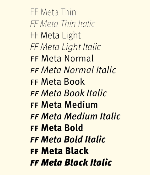
BEFORE
AFTER
Typography
I chose Source Sans Pro because it maintains all of the positive qualities that Meta possesses (the font my client used), and it is an approachable, web-friendly font that is clean and casual. I wanted to pair Source Sans Pro with a solid serif font, Merriweather.
BEFORE
AFTER
Image Assets
Original photography was essential for the new site, so I produced and art-directed photoshoots to obtain the images needed for the site. I hired the photographer, scouted the location, made a call sheet, managed the shoot and edited over 300 images.

sketches, wireframes and mock-up

I made a few basic wireframes to apply to the main types of pages needed for the site: homepage, procedure/technology pages, and specialty pages.
This homepage mock-up proved as an opportunity to present all of my work, packaged together, before building the physical site. My visual branding, wireframe structure, and photo assets could live together harmoniously. Once this direction was approved, I could confidently start building the site.

Before and after

BEFORE
• not responsive
• poor information architecture
• design circa 2007
AFTER
• fully responsive design
• clean and visually cohesive
• organized and approachable
View Website